
Why Framing? A creative approach to displaying your art
January 31, 2017
Introducing SFC Framing Stories A piece of family history worth the wait
May 16, 2017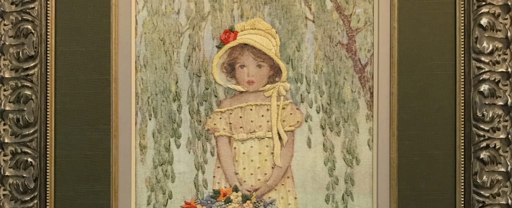
As I’m sure you have seen before, a bad frame can make a great piece of art look horrible. It can be the most beautiful piece of watercolor or photography that you’ve ever seen, but you can’t seem to make it past that awful frame. Since working in the framing industry, my personal taste in framing has definitely become refined. I’m a self-proclaimed “framing-snob” due to this, and I find myself on vacation judging the hotel’s framing choices like a stuck-up sommelier.
It cannot be denied though…a great frame completes a great piece of art. Something about a frame really makes it final touch the artist/art owner can add.
Here’s a great story of how much a frame speaks for the entire look:
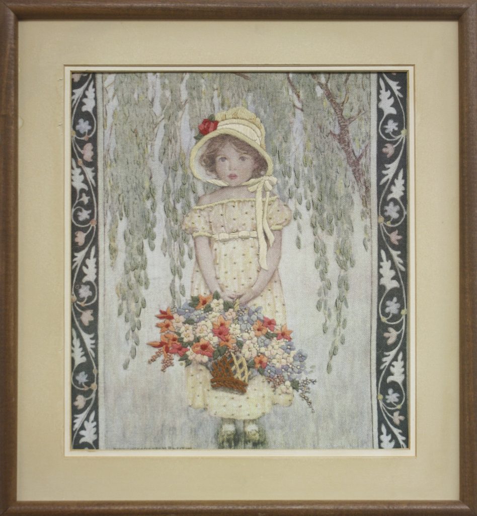
Before we opened, I found a beautiful needlepoint at a resale shop in Michigan City. At first blush, it didn’t seem to be anything fantastic. Upon closer inspection, I noticed the lovely muted color palette and detailed hand-embroidering on the piece. That frame though….oh boy. Dated, falling apart…and no glass? I’m surprised the bugs haven’t ruined the piece when I found it. Regardless, I saw something potential in the art itself that was calling for a new frame. So I bought it for $5.00, a worthy investment for the quality of work I was getting.
When I got it back to the shop, I had to do first things first….remove that awful frame! Sure enough after disassembling the frame, I noticed that there was no protection for the artwork from the back and the mats were starting to cause the fabric to fade. This is inevitable when using anything other than acid-free or rag mats on your artwork. If it’s important enough to frame, it’s important enough to do it right. Use acid-free mats on everything. Period.
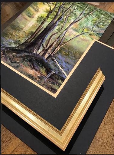
Looking at the piece by itself now, I was able to let my imagination run wild: Which frame to choose? What mat colors would make it shine in the frame? Fillets? Yes please! I allowed myself to do the best design for the artwork as I know it would serve as a great example in the showroom. I ended up choosing three mats, two fillets, and one frame for this piece.
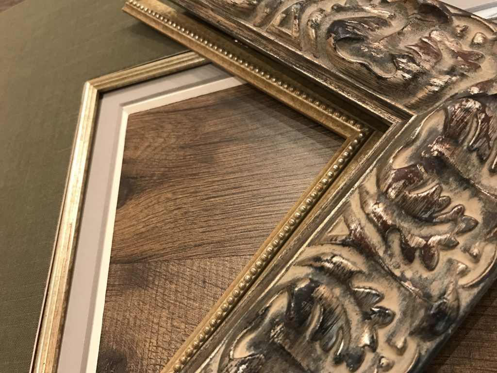
First, I picked out my topmost mat, a silk covered mat from Crescent to accent the embroidering in the original work extend the texture in the overall look. The darker mat also helped to make the softly colored artwork stand out. But I needed some depth, so I added two other mats: one to create a clean, lifted edge with a thick-cream 8ply mat showing just the bevel. The other: A 1/2″ reveal of a soft lavender, solid-core mat to complement the rich greens in the silk and add a splash of muted color to the overall design without overpowering it. I added a Hudson-inspired, silver fillet to make it shimmer just enough to get the viewer’s attention. This fillet also matched the frame I chose, an ornate silver Prague moulding with an added silver beaded fillet to match the inner fillet. What sold me on the frame was the flowing acanthus-like pattern in the frame that matched the colors and mood of the painting without distracting from it. I made the decision to cover the floral design on the original opening to make the piece more vertical and elongated the mats to match. The final touch? Museum Glass of course!
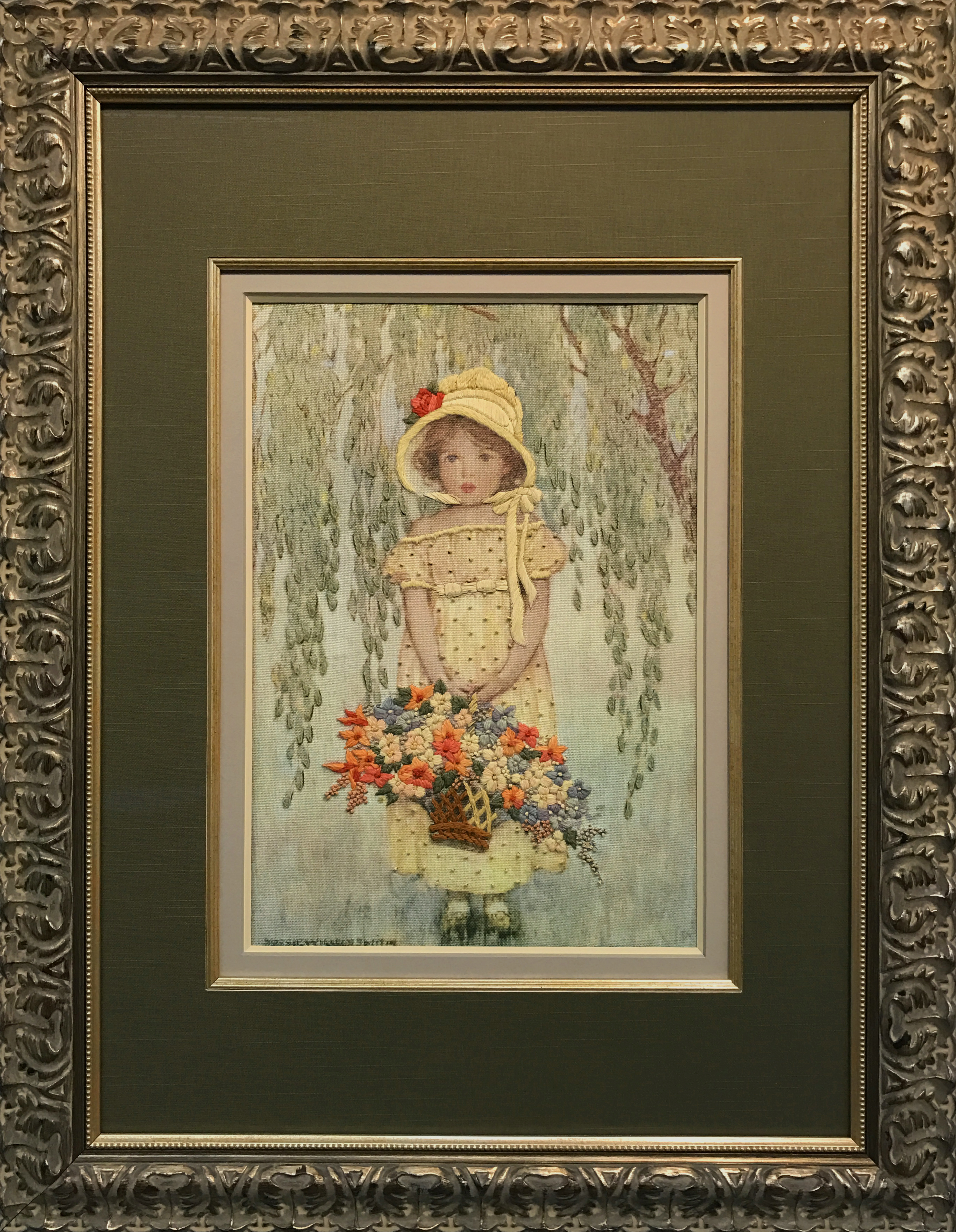
Looking at the final design now, I’m pleased with the results. It makes a great addition to our showroom and no one assumes that I purchased the piece for only $5. Lesson learned: Don’t judge a piece of artwork by it’s frame. Sometimes, all it needs is a princess-story happy ending with a new look to make it look like a million bucks!