“Pantone’s Color of the Year, Viva Magenta 18-1750, vibrates with vim and vigor. It is a shade rooted in nature descending from the red family and expressive of a new signal of strength. Viva Magenta is brave and fearless, and a pulsating color whose exuberance promotes a joyous and optimistic celebration, writing a new narrative.
This year’s Color of the Year is powerful and empowering. It is a new animated red that revels in pure joy, encouraging experimentation and self-expression without restraint, an electrifying, and a boundaryless shade that is manifesting as a stand-out statement. PANTONE 18-1750 Viva Magenta welcomes anyone and everyone with the same verve for life and rebellious spirit. It is a color that is audacious, full of wit and inclusive of all.”
Excerpt from https://www.pantone.com/color-of-the-year/2023
In framing, a good framer is always trying to make sure the frame design is not overshadowing the art. With such a bold color for 2023, it’s going to take the right type of artwork for us to recommend a magenta frame. However, pulling shades of magenta already in the art, or using similar colors are a great way to use this as inspiration for your frame design. Here are a few examples:
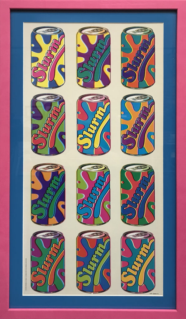
In this Pop Art rendition of the iconic “Slurm” drink of the TV show Futurama, you have ALL the permission to go crazy with pops of color. The blue mat almost reads as a neutral color compared to the saturation of the artwork and contrasts perfectly with the “Cha-Cha” vivid pink of the faux leather frame from Bella Moulding’s Malecon Collection. The end result, while bold, is brilliant! It’s simple, yet effective as a celebration of the color in the art.
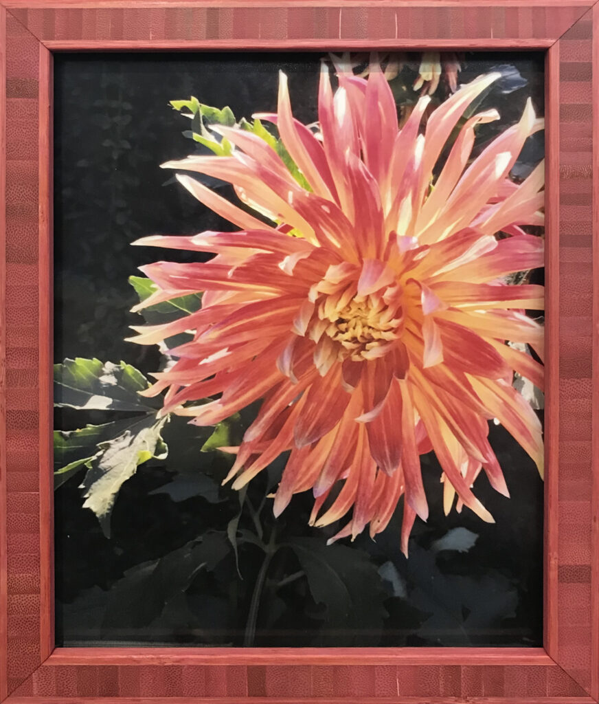
Our client loved the colors in the flowers of this photo she took, and wanted the framing to reflect that. Instead of adding a mat, we used an elegant, bamboo-inlay frame from Bella Moulding called Bambu. The pattern worked perfectly with the repetition of the petals in the flower, yet still remained earthly and bright.
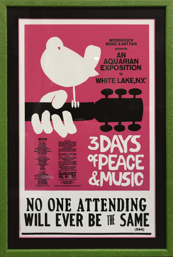
Sometimes, you need to go in the opposite direction to make your colors stand out. How? Find it’s complement! Instead of jumping in with all the magenta frames and mats on this Woodstock poster, we decided to recommend a simple pink-core mat to pull out the magenta in a more subtle manner. We then paired with the embossed Nopale-colored frame from Bella’s Frida collection to give the client a psychedelic feel that they loved about the era. The opposite of vibrant pink? A soft, green frame. Groovy!
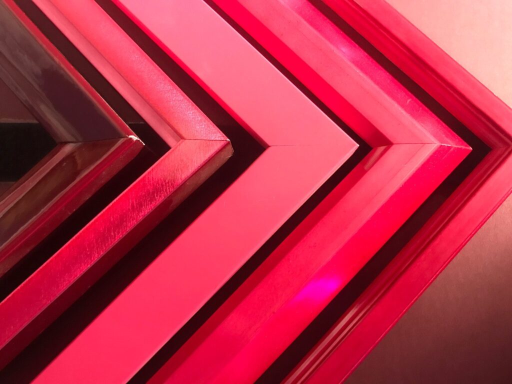
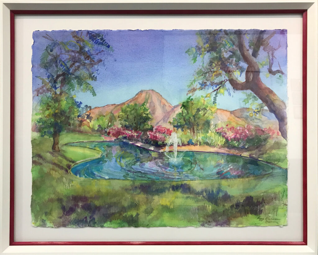
This treasured piece of art is by artist Peggy Macnamara, the artist-in-residence at the Field Museum at Chicago. Her use of color gives her scientific illustration background a unique look. Since we have worked with this client many times in the past, we knew she loved colorful frames, but still wanted that clean, house-by-the-lake look for the California home. We opted for a pop of color with a magenta frame stacked with a sloped white frame to allow the watercolor space to breathe yet still remain colorful. Paired with Bella’s Pop! collection in Fushia.

