
Framing Variety: South Shore Posters
April 8, 2020
2022 Pantone Color of the Year: Very Peri
January 20, 2022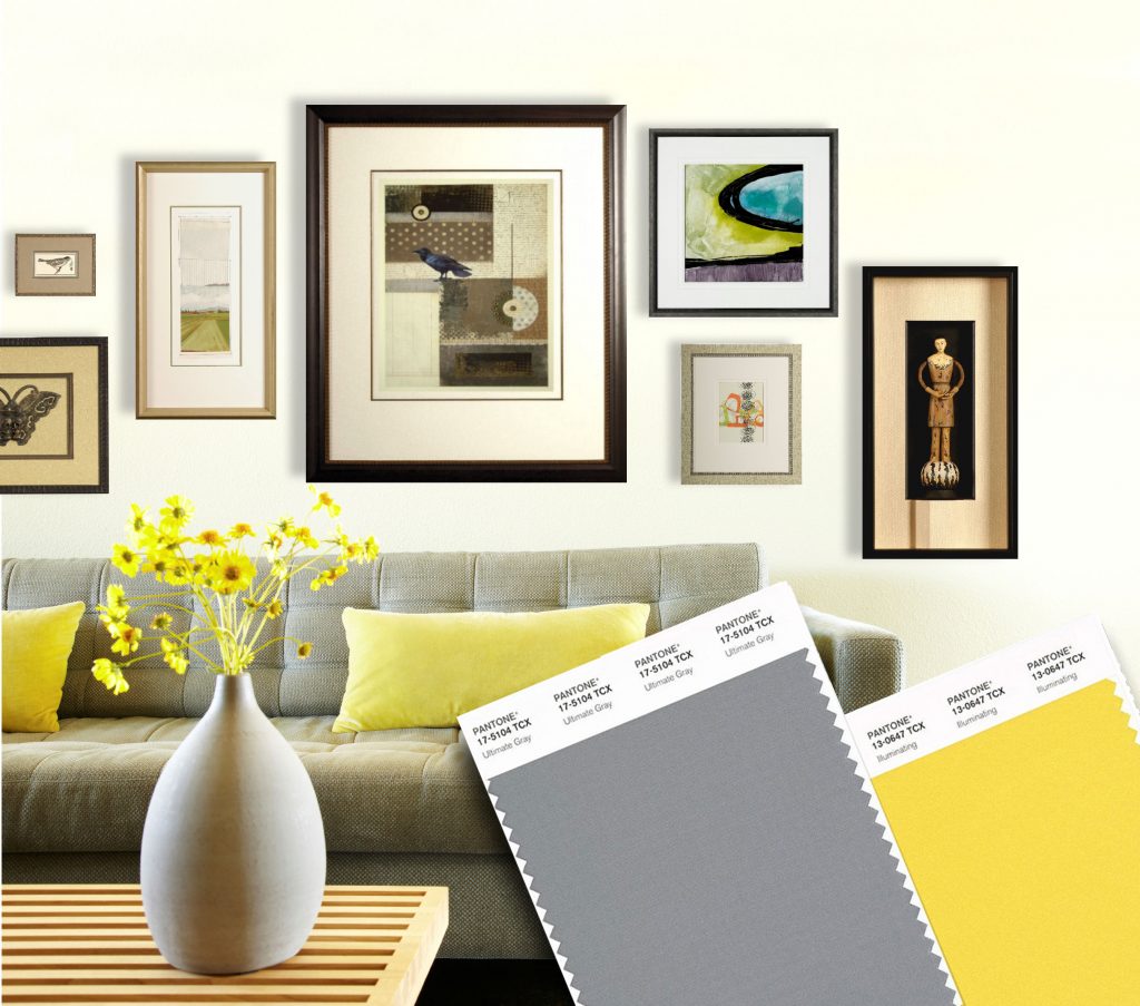
In case your stuck at home and haven’t heard, Pantone released their anticipated 2021 Color of the Year! On par with 2016, this year features two colors, PANTONE 17-5104 Ultimate Gray + PANTONE 13-0647 Illuminating. This combo of gray and yellow highlight the duality of two hues, but really showcases the beauty of gray.
Yes, gray.
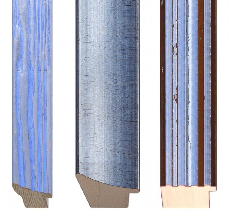
Have you really ever noticed gray before? (Or maybe you prefer grey with an “e” instead of an “a.”) Most people think of gray as a boring color on it’s own, but if you take the time to really study it, gray can be a revealing color.
Gray can be a very exciting color for artists. Gray is never boring. Gray is never dull. Gray is a the ultimate tool to allow your other colors to be their best, while never taking the credit. Gray is your best friend.
If you can’t tell already, I love gray. It might be my “favorite” color, mostly because it is so undervalued and functional. But this year, gray is having it’s time in the sun — Literally, next to Illuminating, a bright yellow. Gray’s time has come.
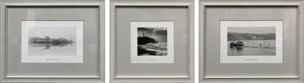
This set of photos by Giles Norman in Bella’s Bijou frame and solid chrome acid free matting. With black and white images, it’s best to not add color (unless you have a grand design scheme worked out with your interior designer). While we could just have easily done a white mat, the soft gray allows the more subtle tones of the photo to shine. The beaded white frame reads gray from a distance, the white and silver colors blending to create an almost continuation of the gray mat, giving these small postcards plenty of space to allow the view to soak in all that lovely gray.
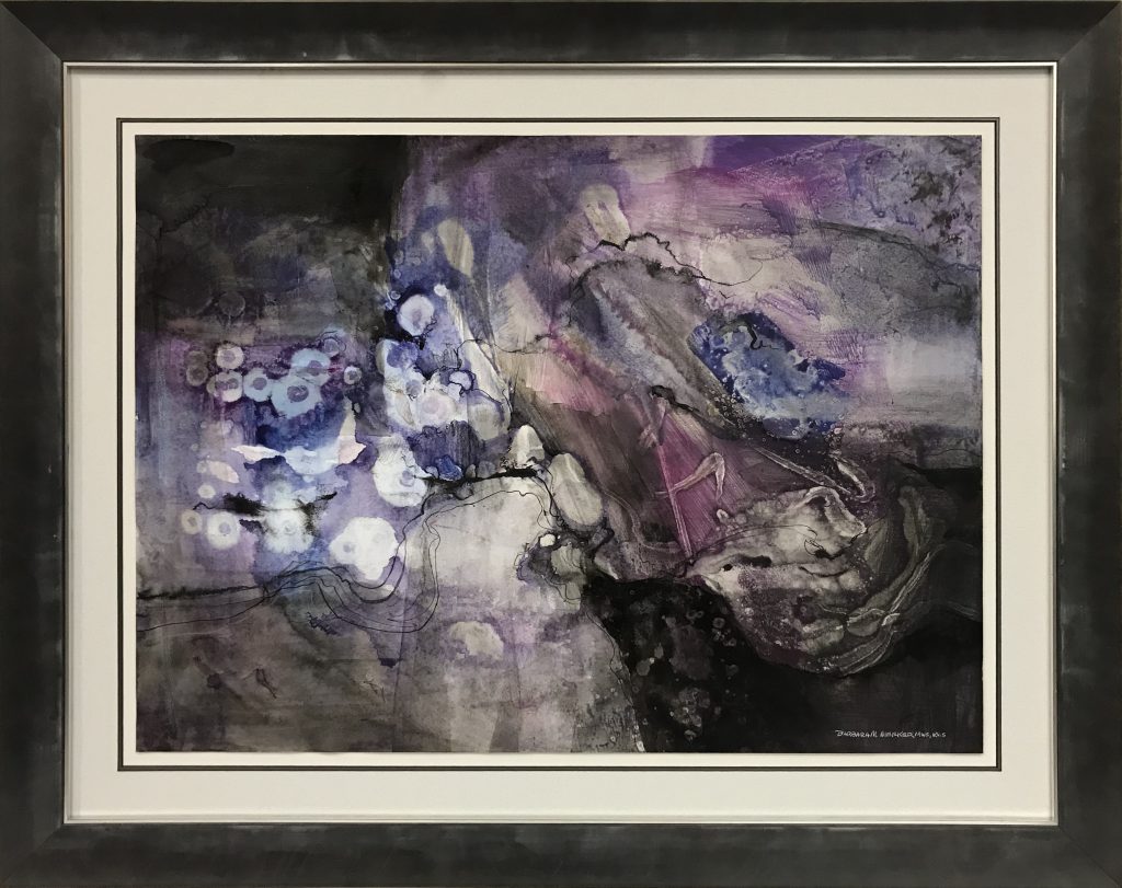
Barbara Meeker is an astonishing local artist here in NW Indiana and her work spans from realistic watercolors to more abstract splashes of color and texture. In this painting, Barbara showcases her more non-representational side with this watercolor on slick Yuppo paper. This piece came in from the collecter already frame, but needing a modern update. We decided to keep the mats simple with a textured, silver mat on the bottom and a light gray on the top. The Luna frame from Bella is paired with a silver-gilded fillet to add a hint of extra contrast between the frame and mat. Essentially, gray on gray on gray on gray. Such a versatile color!
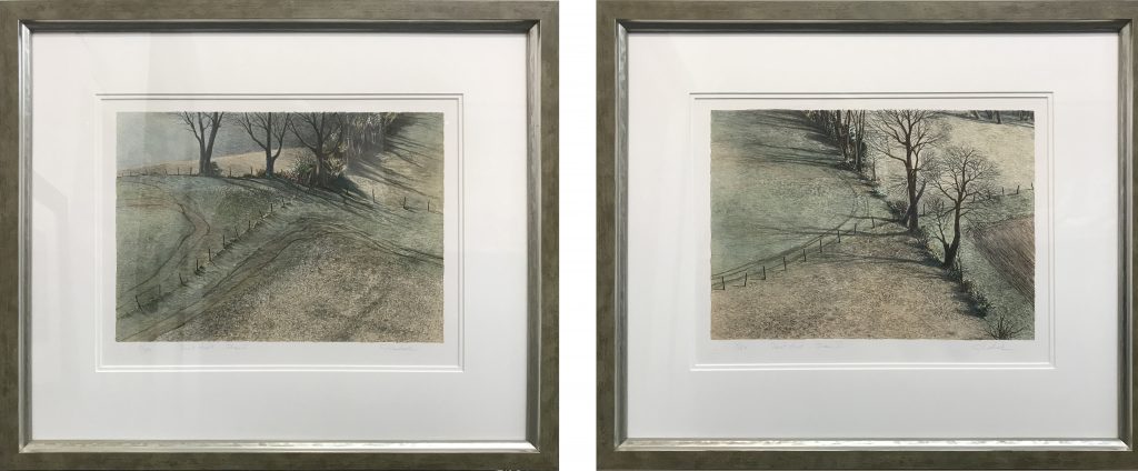
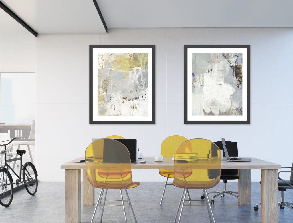
Gray is unique in that it can pickup other colors without being obvious. For example, these two prints have a beautiful sage tone throughout the background, and the Lucerne frame from Larson Juhl picks up that subtlety with simplicity and elegance. “This moulding is inspired by the movement and motion of Lake Lucerne in central Switzerland. The frame presents the look of real silver mixed with textured panels of color, which is reminiscent of both modern and traditional styles.
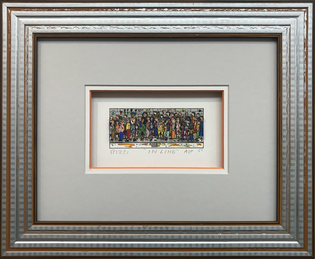
Anything but boring, this Gingham frame from Bella is both fun and contradicts the monotony of the artist’s “In Line” theme. The orange is allowed to shine with only slight suggestions of color in the frame and a color-core white mat adjacent to the chrome mat. The gray acts as a textured backdrop to allow the artist’s work to shine without distraction.
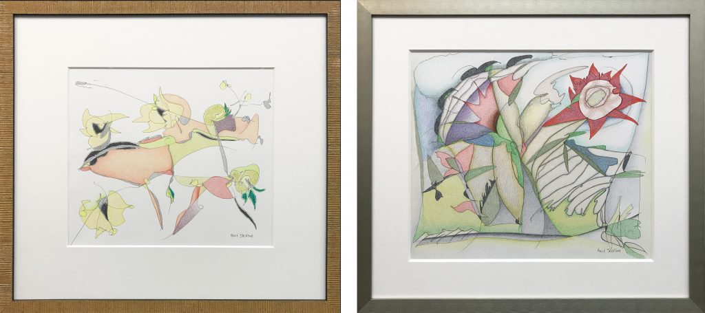
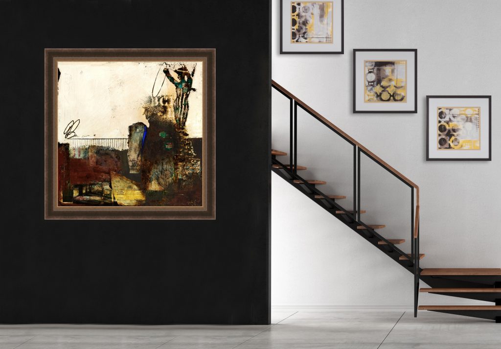
Chesterton based-artist Holly Jackson is known for her bold abstracts, but these newer works have a more subdued side using colored pencil and graphite on paper. This client is a collector of Jackson’s work and has used both gray and yellow frames to complement the colorful pieces. These two projects show how useful a bold and a muted frame can enhance the work. Note that the yellow frame had wider mat borders than the gray frame, as to not overpower the artwork itself.
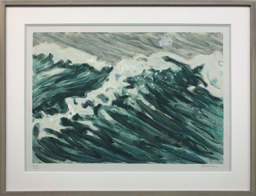
When this lithograph came into the gallery for framing, I had a vision for it before we even pulled any frames down. Luckily, the client was very open to my suggestions, and we agreed with the overall design. A sea foam green bottom mat adds a hint of color, while the topmost mat closely matches the color of the paper. A simple, grey-finished cap add the final touch for a modern and sophisticated presentation of this stunning work.
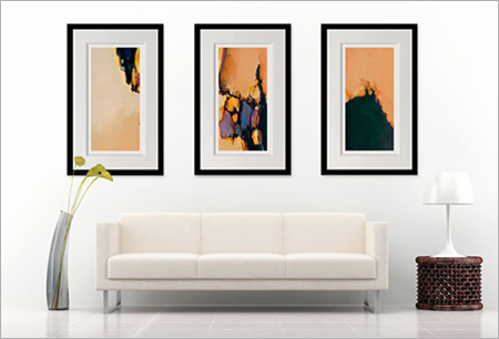
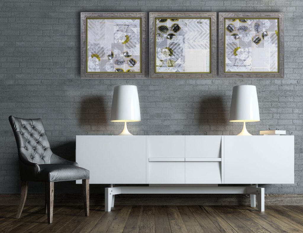
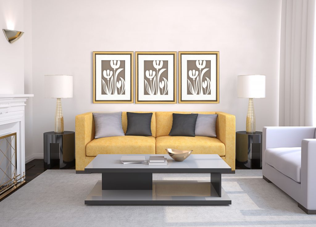
(Above) Some images for more inspiration of the gray/yellow theme of the Color of the Year 2021.
I encourage you to look at Gray as more than just boring color — see the possibilities of gray!
– Can you use it to enhance a different color in your art?
– Is it the gray more blue, green, or red?
– Can to pair with another color to use bold color more effectively?
– How dark should the gray be?
– Don’t forget metallic — Silver is just a gray in disguise!
Your friendly neighborhood framer,
– Kristina (Gray Enthusiast)