
A Fresh Look at Gray
January 9, 2021
Pantone’s Color of the Year: Viva Magenta
January 4, 2023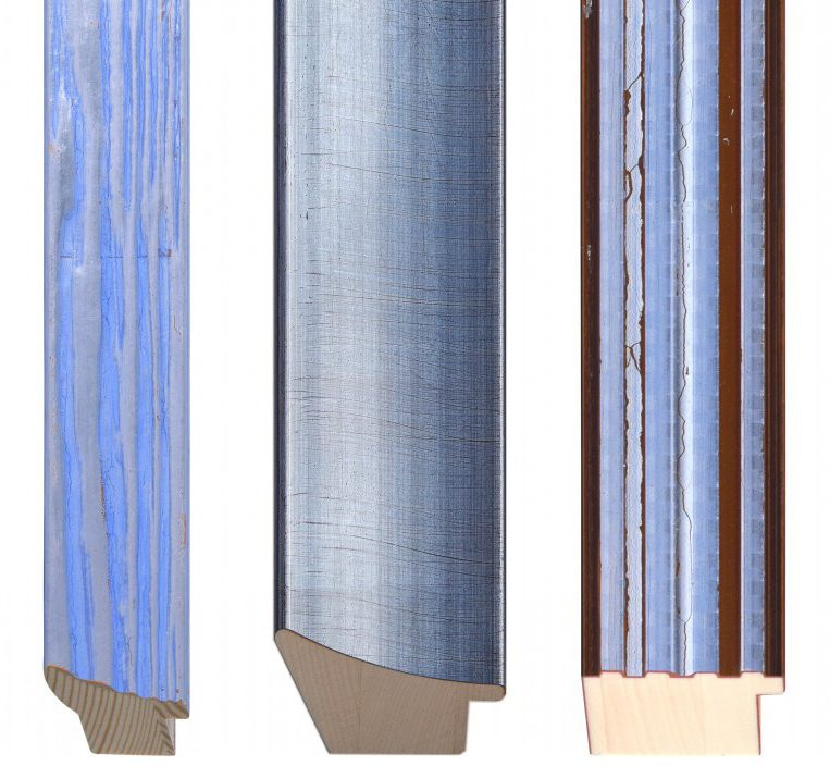
Every year, the Pantone Institute of Color claims a new “Color of the Year”
This January, Pantone chose #17-3938 “Very Peri,” a much needed boost of color after last year’s gray/yellow combo. Calming, yet also vibrant, “Very Peri” is a welcome boost of soothing, periwinkle energy after almost of two years of uncertainty. This versatile color can be used as tranquil neutral used in addition to the regular whites, grays, and blacks; But also as a fresh pop of color for a modern twist on vibrant color in art and design.
“Displaying a carefree confidence and a daring curiosity that animates our creative spirit, inquisitive and intriguing PANTONE 17-3938 Very Peri helps us to embrace this altered landscape of possibilities, opening us up to a new vision as we rewrite our lives. Rekindling gratitude for some of the qualities that blue represents complemented by a new perspective that resonates today, PANTONE 17-3938 Very Peri places the future ahead in a new light.
We are living in transformative times. PANTONE 17-3938 Very Peri is a symbol of the global zeitgeist of the moment and the transition we are going through. As we emerge from an intense period of isolation, our notions and standards are changing, and our physical and digital lives have merged in new ways. Digital design helps us to stretch the limits of reality, opening the door to a dynamic virtual world where we can explore and create new color possibilities. With trends in gaming, the expanding popularity of the metaverse and rising artistic community in the digital space PANTONE 17-3938 Very Peri illustrates the fusion of modern life and how color trends in the digital world are being manifested in the physical world and vice versa.”
– Leatrice Eiseman Executive Director of the Pantone Color Institute
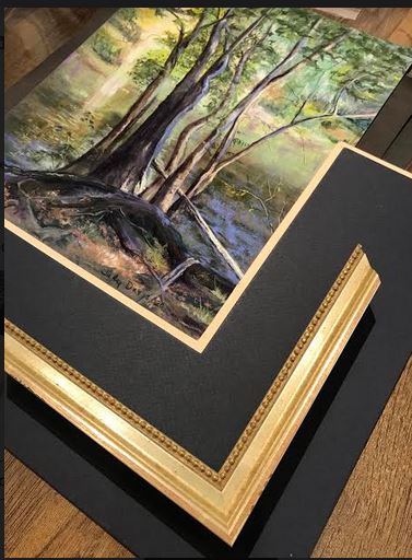
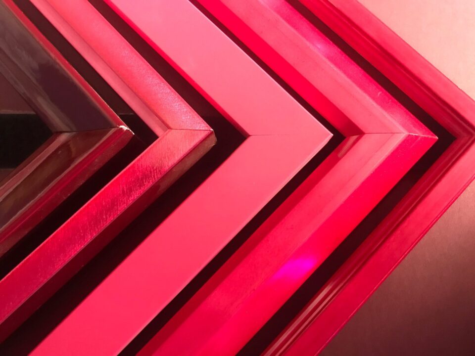
Take a look below to see some examples of “Very Peri” in either the art, frame, or mat design:
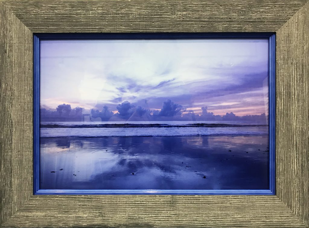
In this “Very Peri” photo of the landscape where the ocean meets the sky, the inner frame was added to create the illusion of the art continuing into the frame. This effect works perfectly only if the colors match, which they did luckily in this situation. The inner frame is Bella’s Pop! Collection of petite, yet colorful mouldings that are great for smaller pieces or stacking frames. This piece needed more of a statement, do we ended up stacking a driftwood-inspired look on top of the Periwinkle frame to create a more rustic and earthy feel. Larson Juhl’s Madison collection was perfect in addition to the colorful frame to give the look of depth (commonly referred to as “looking through a window.”)
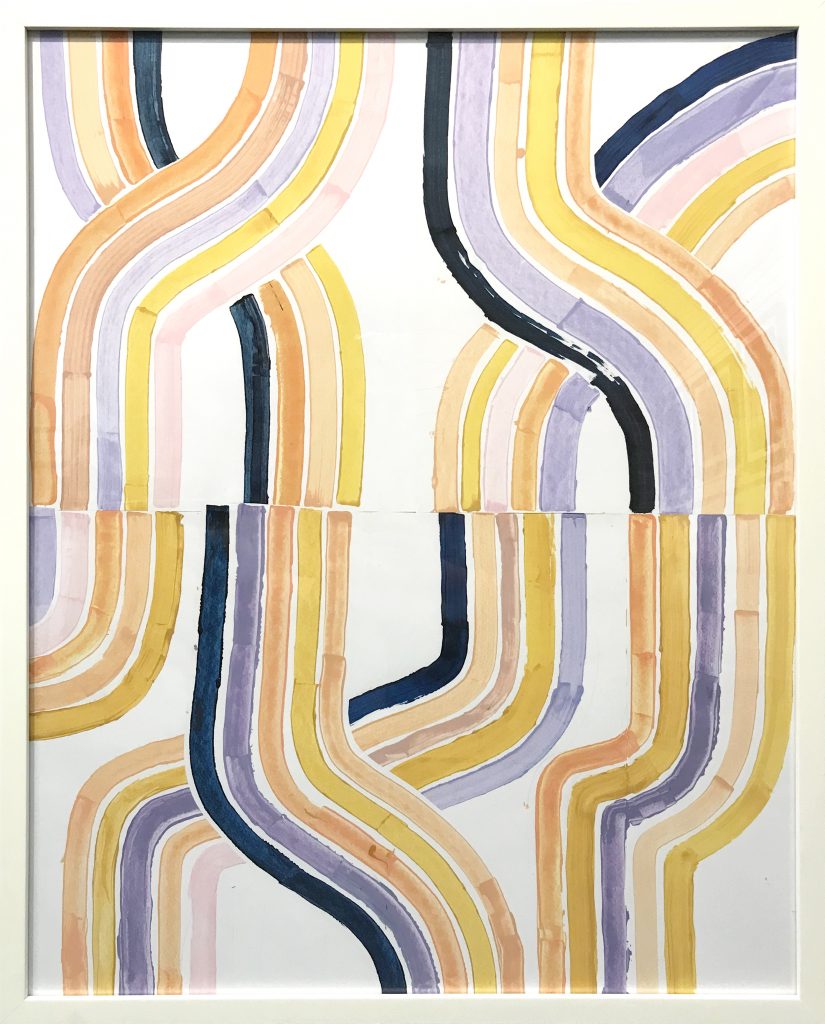
Simple art = Simple framing! While this piece of art has many beautiful colors to be inspired by, we choose NOT to use color and instead let those colors shine on their own with a simple, off-white frame with no mat. While the lovely periwinkle color was present, sometimes to let a color pop, you need to not pull it out again in the mat or frame choice. Also, great design doesn’t have to break the bank — this is a clearance frame!
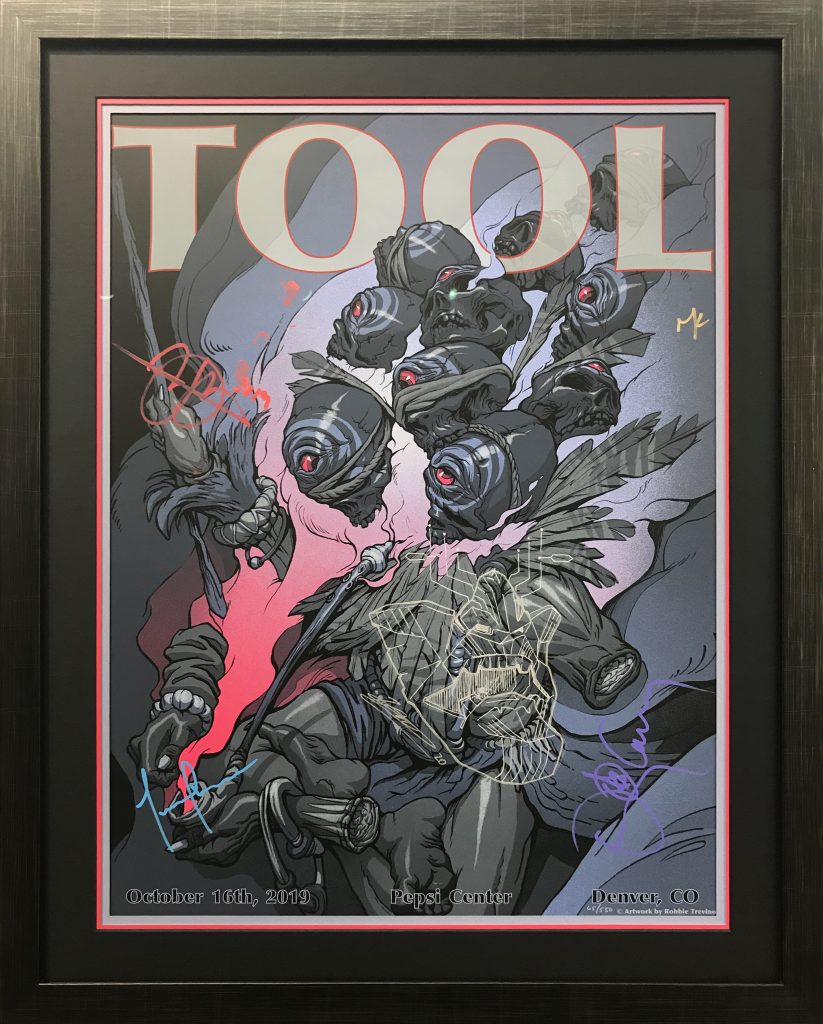
We LOVE framing TOOL posters! Especially when we can add some exciting designs to the already well-designed posters. In this example, our hardcore TOOL client had many posters and wanted them all framed similarly, yet unique to each poster as well. We decided to use the same frame to keep the looks consistent with his other posters but allowed some freedom of choice with the mat colors, particularly the bottom-most mat, and the color core of the top mat (black to be also consistent). The very-periwinkle bottom mat was perfect to match the colors in the poster’s text but added a pop of hot pink for contrast. Our frame is an in-stock scratched black with a champagne finish. Yes, the poster is signed AND custom doodled by the artist, How cool is that?!
Pro-tip: We actually didn’t carry the exact “hot pink” in a color-core option for this design, but we ended up using three mats to create the “look” of a color-core mat. So what you see is actually three mats in total (top = black-core black, middle = hot pink with 1/8″ reveal, bottom = periwinkle with 1/4″ reveal — all reverse bevel for effect).