June 17, 2023
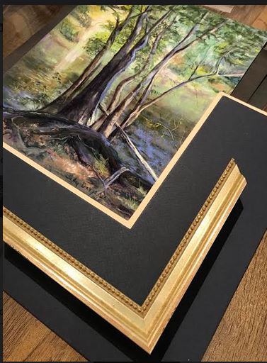
Questions on framing pastels are one of the most frequent questions we get as picture framers. If you have ever had a chalk pastel to be […]
January 4, 2023
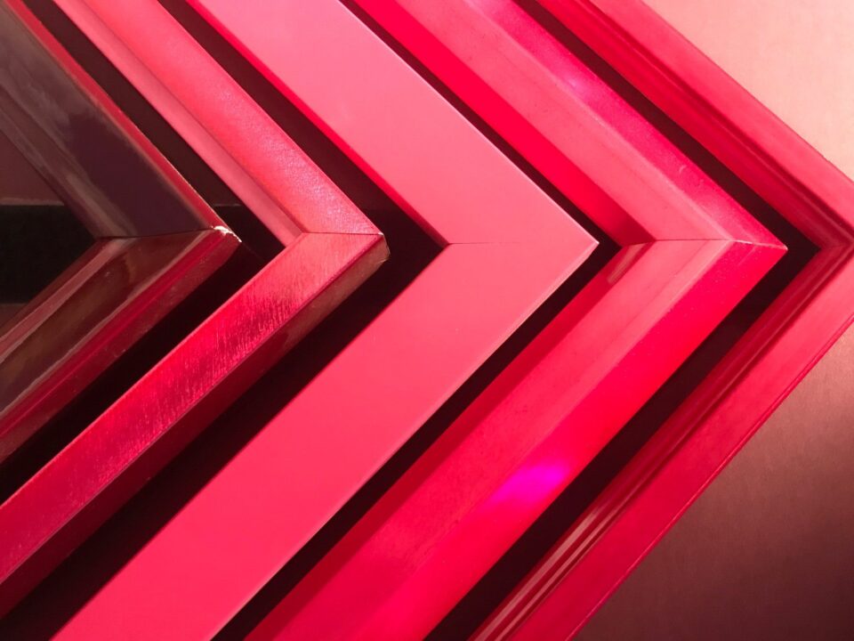
“Pantone’s Color of the Year, Viva Magenta 18-1750, vibrates with vim and vigor. It is a shade rooted in nature descending from the red family and […]
January 20, 2022
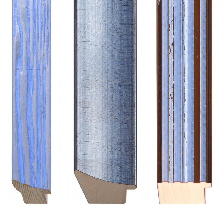
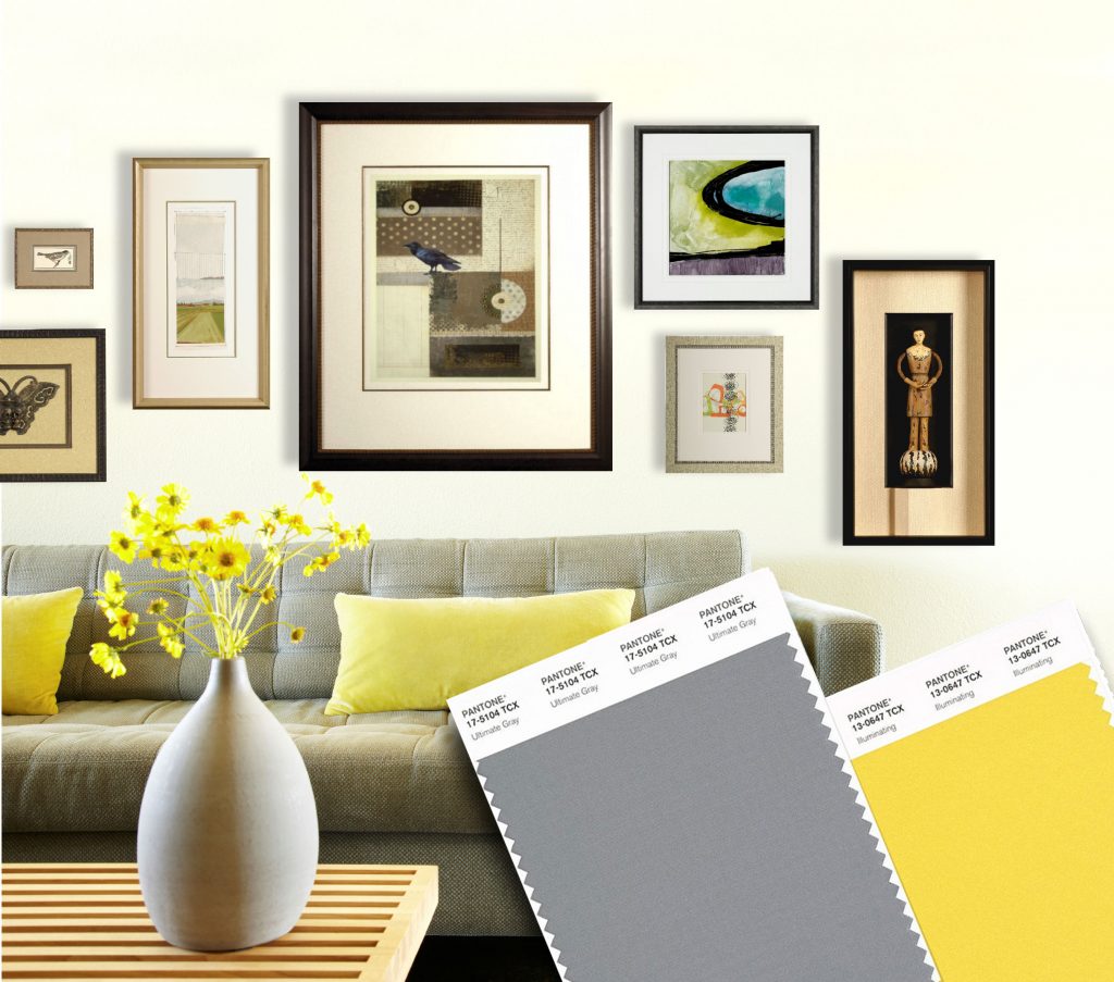
Every year, the Pantone Institute of Color claims a new “Color of the Year” This January, Pantone chose #17-3938 “Very Peri,” a much needed boost of […]
January 9, 2021
In case your stuck at home and haven’t heard, Pantone released their anticipated 2021 Color of the Year! On par with 2016, this year features two […]
April 8, 2020
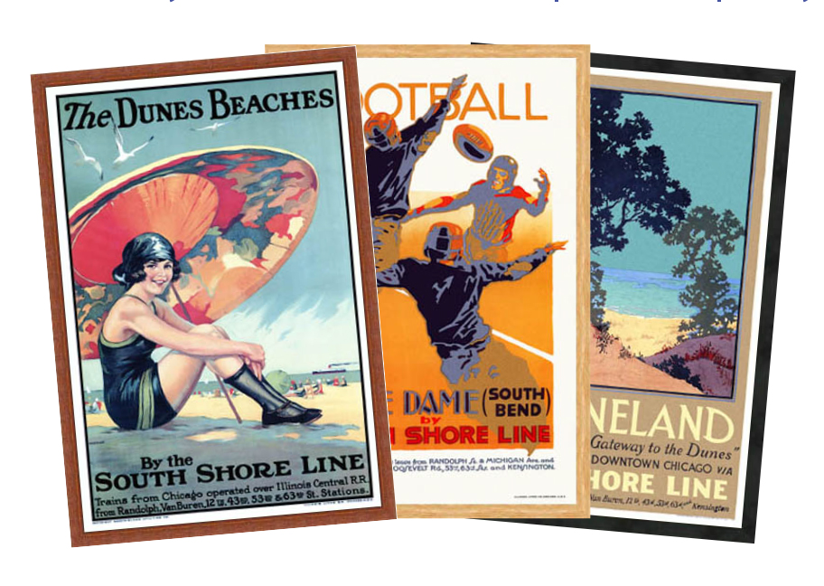
As you may already know, we carry dozen of the classic 1920s poster from the South Shore Collections. We offer poster specials for these, but seeing […]
April 2, 2020
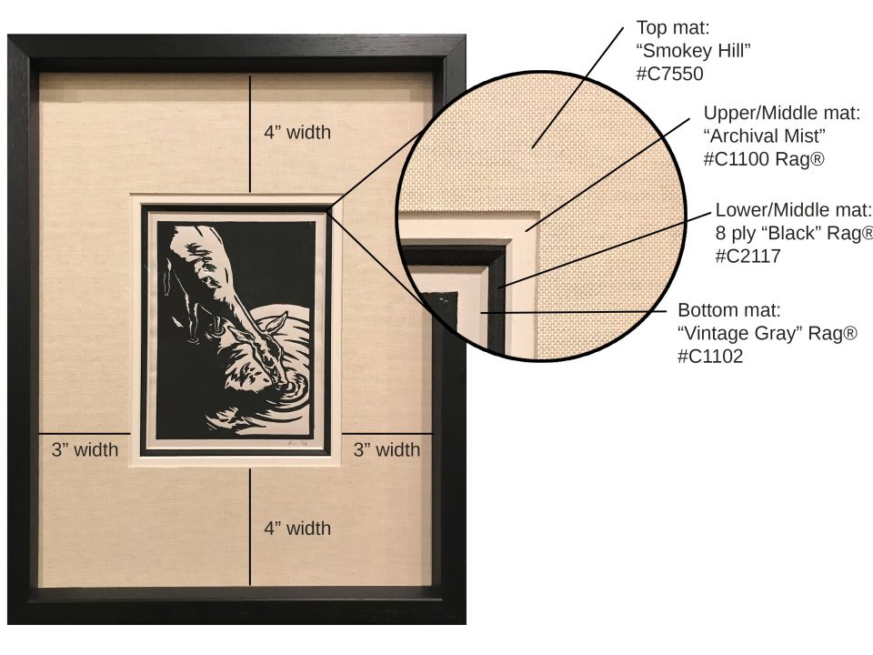
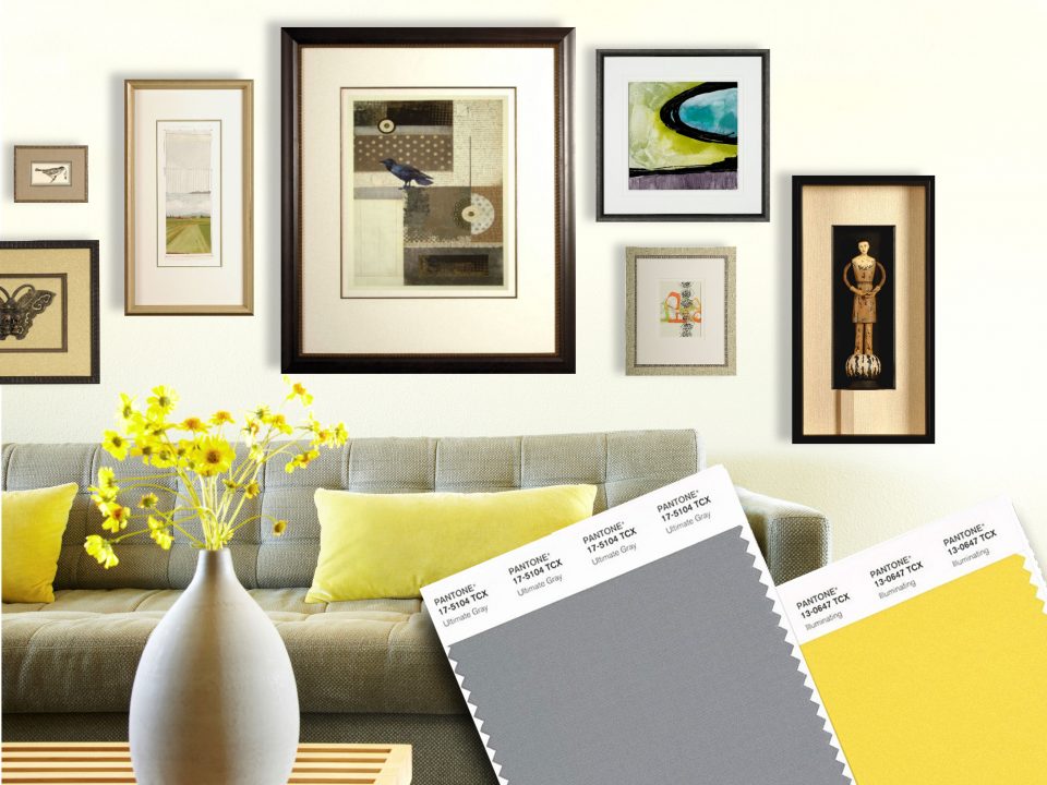
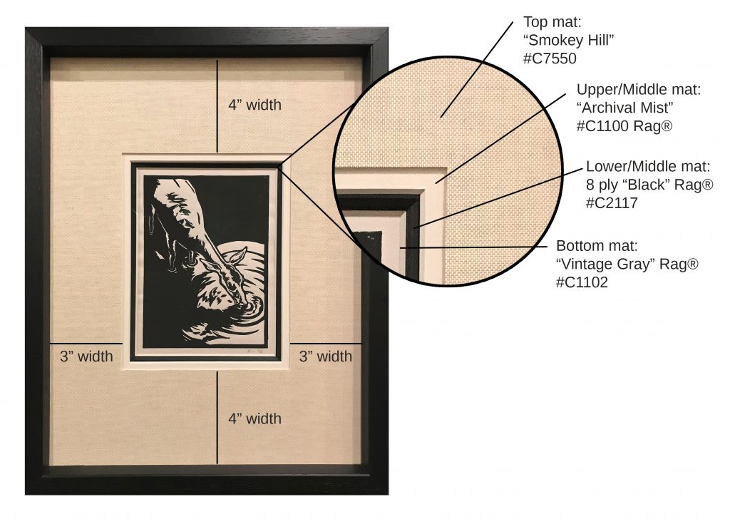
Choosing the right mats for your artwork can be a daunting task — What colors should you use? How many mats is too much, or not […]
January 14, 2020
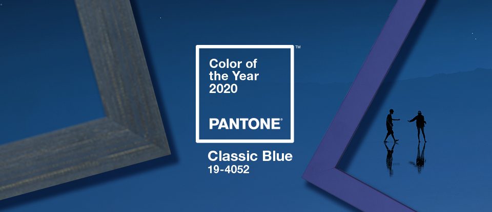
Get Inspired by Pantone’s 2020 Color of the Year: Classic Blue Who doesn’t love the color blue?This year, use Pantone’s 2020 Color of the Year as […]
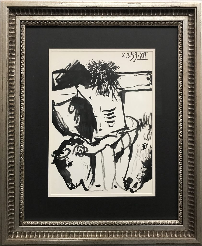
October 31, 2019
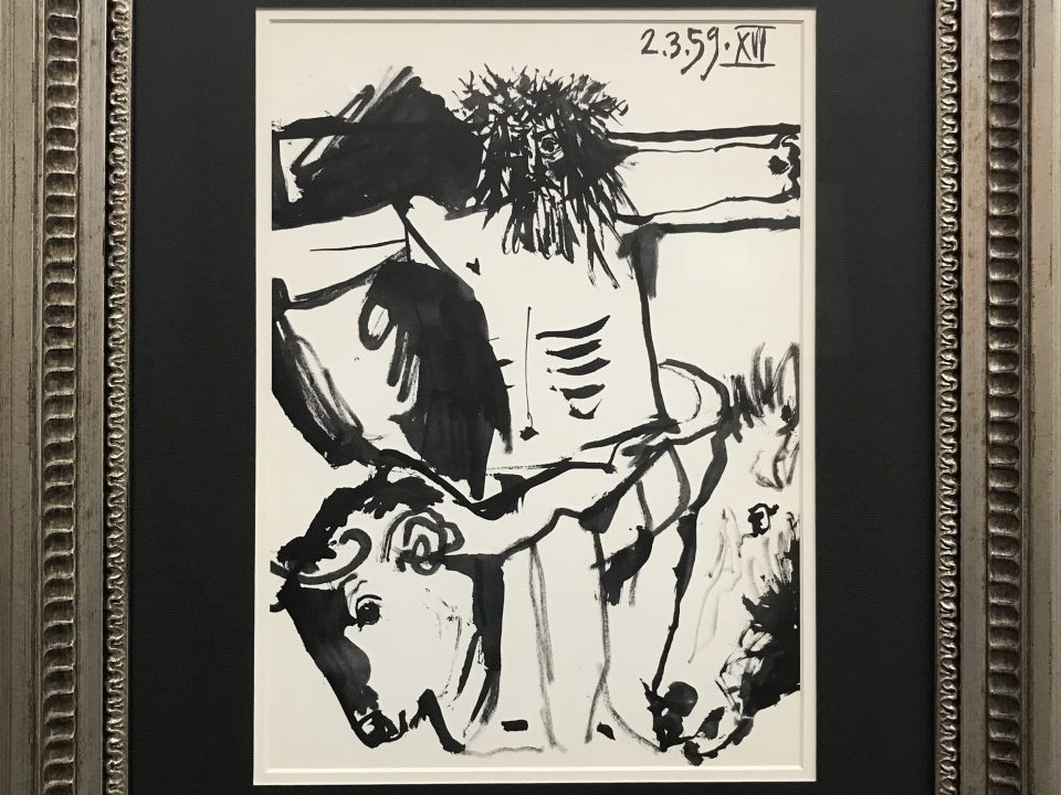
Celebrating the genius of Picasso & the beauty of custom framing By Maureen O’Connor, Tru Vue® Marketing Manager Check out this article from Tru-Vue that features […]
October 18, 2019
Using Black Frames Creatively This October, we thought we’d visit one of our most popular frame color — BLACK! Most people assume a black frame is […]
May 29, 2019
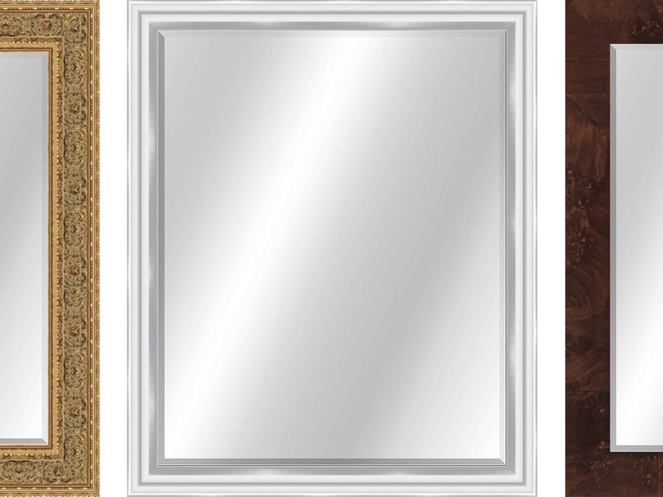
Our latest newsletter went into detail on using mirrors to add light, space, and interest to your room. An essential mirror to most people is the […]